Dashboards are becoming a common tool to help you view and analyse the sample management data available from your LIMS and draw conclusions faster.
The visualisation of data in real time provided by a dashboard makes it much easier to:
- Identify bottlenecks or peaks of demand (such as a backlog of sample requests on Wednesdays when there is capacity on Tuesdays)
- Make business decisions (such as whether the purchase of a new store is justified)
- Investigate and discover root causes (such as why an instrument may be under used)
- Highlight benefits (such as the number of samples processed per day)
- Find opportunities for improvement (such as reporting on lab waste)
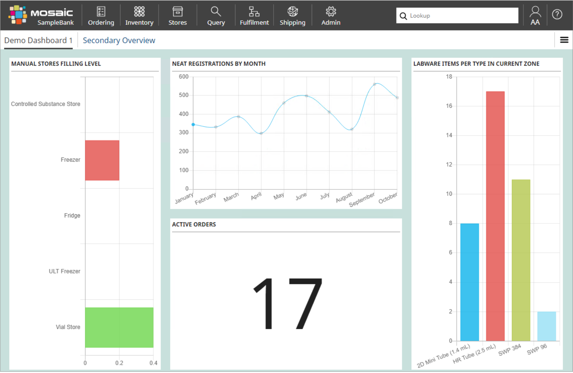
The key here is not just to visualise data, but to be able to select the dashboard metrics that will be most helpful to your role.
A lab operator might want to see the status of current work and review progress:
- How many orders are in progress
- How many orders are waiting to be started
- How many samples shipped, and arrived
- How many new samples were delivered today
- Which freezers have the most space
For instance, if labware items are building up in one particular zone because processing can’t keep up or due to a fault, a dashboard can highlight that.
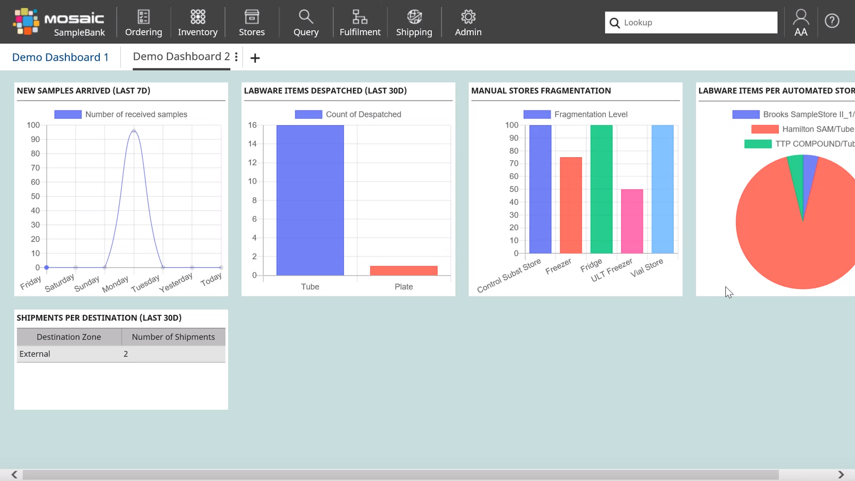
A lab manager might want their own dashboard of lab data to see:
- Where peaks of demand are
- How people are using equipment
- The status of sample stocks
- To check fragmentation in manual stores to ensure space is being used efficiently.
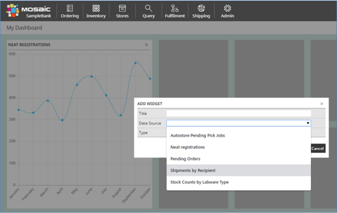
While many LIMS systems offer dashboard functionality, these are most useful when they can be easily customised to suit individual companies or roles. This empowers anyone on the team to create charts and automated reports that can be shared with others to inform and speed up decision making. For instance, Titian’s Mosaic software allows users to easily personalise a dashboard by adding their own queries and rearranging the display.
One real-life dashboard use case is in-company advertising. While efficient sample management is essential to the smooth running of a variety of drug discovery groups, this role is often underappreciated. A dashboard displayed on-screen outside a lab can be used to highlight how much work the sample management team does.
A different use case is to flag problems early. One company didn’t realise that sample orders were piling up because the connection with their automated store was broken. Email alerts had been sent but these were buried by the volume of email the user was receiving. Creating a dashboard displaying blocked automated stores meant subsequent problems were picked up much faster. It is possible to present metrics for an instrument health check dashboard to provide early failure warnings, for instance, if an instrument doesn’t report back to the LIMS in its usual timeframe.
A third use case is where a company reduced lab waste and made purchasing more efficient by reporting on labware types used. This allowed them to standardise on their most used varieties.
Dashboards cannot replace the complex data processing that tools like Spotfire provide. However, LIMS dashboards and data processing tools can be combined in interesting ways. For instance, Titian’s Mosaic sample management software can be integrated with APIs (Application Programming Interfaces) that many data processing systems expose, where the API can be called from within the canned query used for Mosaic dashboards. This has the potential to display complex information from the LIMS like how many compounds are registered, and how many of these are present in Mosaic’s inventory.